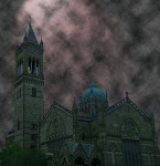
The room was humming harder
As the ceiling flew away
Only in our minds and SL can songs, dreams, or thoughts become vivid creations that interact with us as easily as a song floats through our thoughts and colors bind and blend with emotions.
As with a great song, a great build depends on the subtle nuances one applies to it, allowing it to be appreciated on many many levels. The difference of just a few degrees can be so great when applied properly to a build. So when building its important to remember the following areas where different shadings can be applied.
1- Color & Tint: Sorro Nishi advises to do the tinting out of SL off world in the program you use to create your textures. This keeps them from degrading as you change them in world. I also advise keeping one copy an original color base so you can go in several directions and not have the base color effect different tints.
when tinting in SL its advise able to use the Color under cursor controller.
2- Shadows: making and using shadows greatly improves the look and feel of your build. Multiple shadows and highlights gives a very realistic look and feel. One of my favorite tricks to do is to make multiple shadows from one source that has several lights hitting one object. Or taking and making shadows different lengths to match the design of the building architecture.
3- Highlights: such as sunbeams or lights from an outside or different source are a great effect to use.
4- SL light settings: one of my favorite builds was for the UWA Flagship challenge where I took and set every single light source to the proper radius and distance so when you walked in to the area the light would shine you could then see it.
5- Multi Layering of textures and prims: can add a truly wonderful effect when Incorporated into a build, a couple of masters at this are DB Bailey and Patch Thibaud, just visit Cetus the sim DB & Patch create on and be prepared to be amazed.
6- Mirroring: of floors walls or even ceilings does make a simple looks take on a dazzling feel, so don't just think stores and ballroom floors can only have a mirror look to it. One of the coolest mirror effects I ever saw was in a vamp castle with the effect dropped down about 30 meters it looked like you were staring in to the abyss.
7- Bias Settings: on a Prim or on a Texture will add a bit to the look you have. You do have to keep in mind with this that the less is more is better effect does come into play.
8- Edit section (Features): will allow you to make prims wiggle and move and let lights do wonderful things. Ill get into this in detail on a later blog, but please go experiment with it. Also the Mapping, Shining and Bumpiness settings in the Texture section on edit have some wonderful effects.
So when the ceiling flies away remember so can you by changing the effects, looks and settings of your builds in SL. Have fun experiment and enjoy.
Good Building
Nyx
Subscribe to:
Post Comments (Atom)


No comments:
Post a Comment